This is a proposed re-branding done for the Turchin Center for the Visual Arts in Boone. It was done in collaboration with Alex Carroll and Lydia Orange.
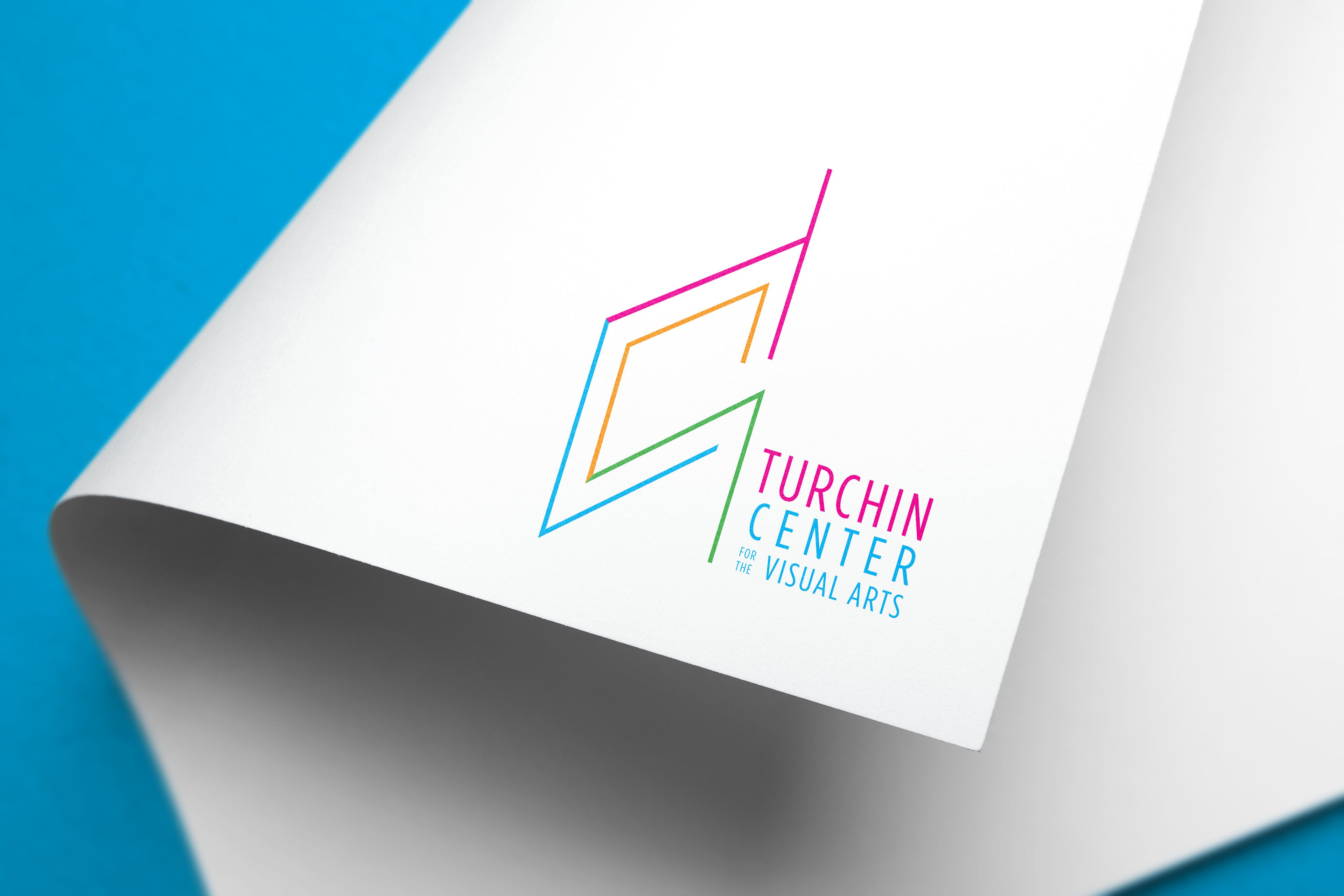
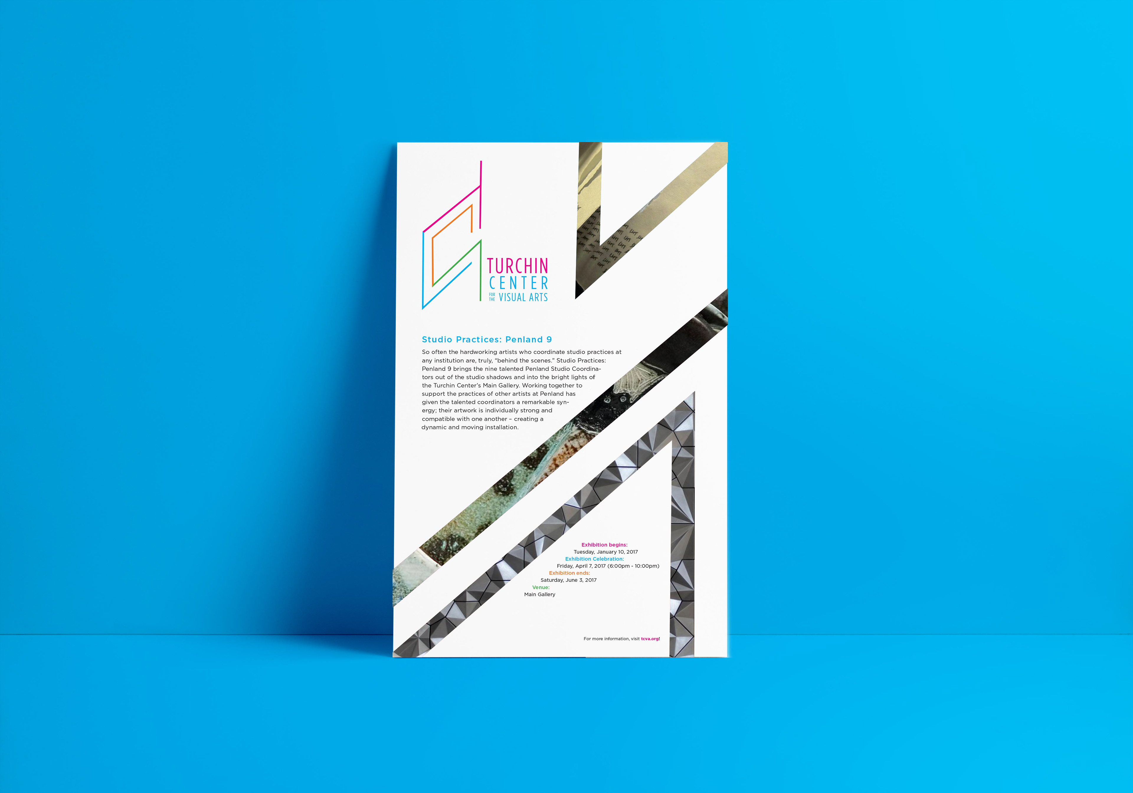
The Turchin Center is all about creating a bridge between Appalachian State University and the surrounding community. They really wanted these connections represented in their new identity, which is why we decided to come up with a logo that connected the letters TCVA. We also wanted to take the Turchin's current four-color logo (the colors of which were reflected in the decor of one of their rooms) and give it a fresh new look, switching out their faded red for magenta and brightening the orange, blue and green.
What makes the Turchin Center different from other art galleries is its unique location in the heart of the Appalachian Mountains. We wanted to do a subtle reference to this, seen in the coloring and location of the V (blue, referencing the river) and the A (green, referencing the surrounding landscape) in the logo.
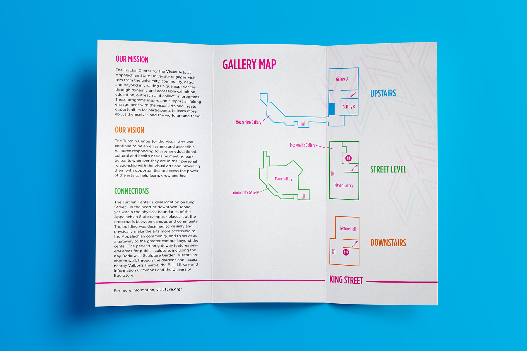
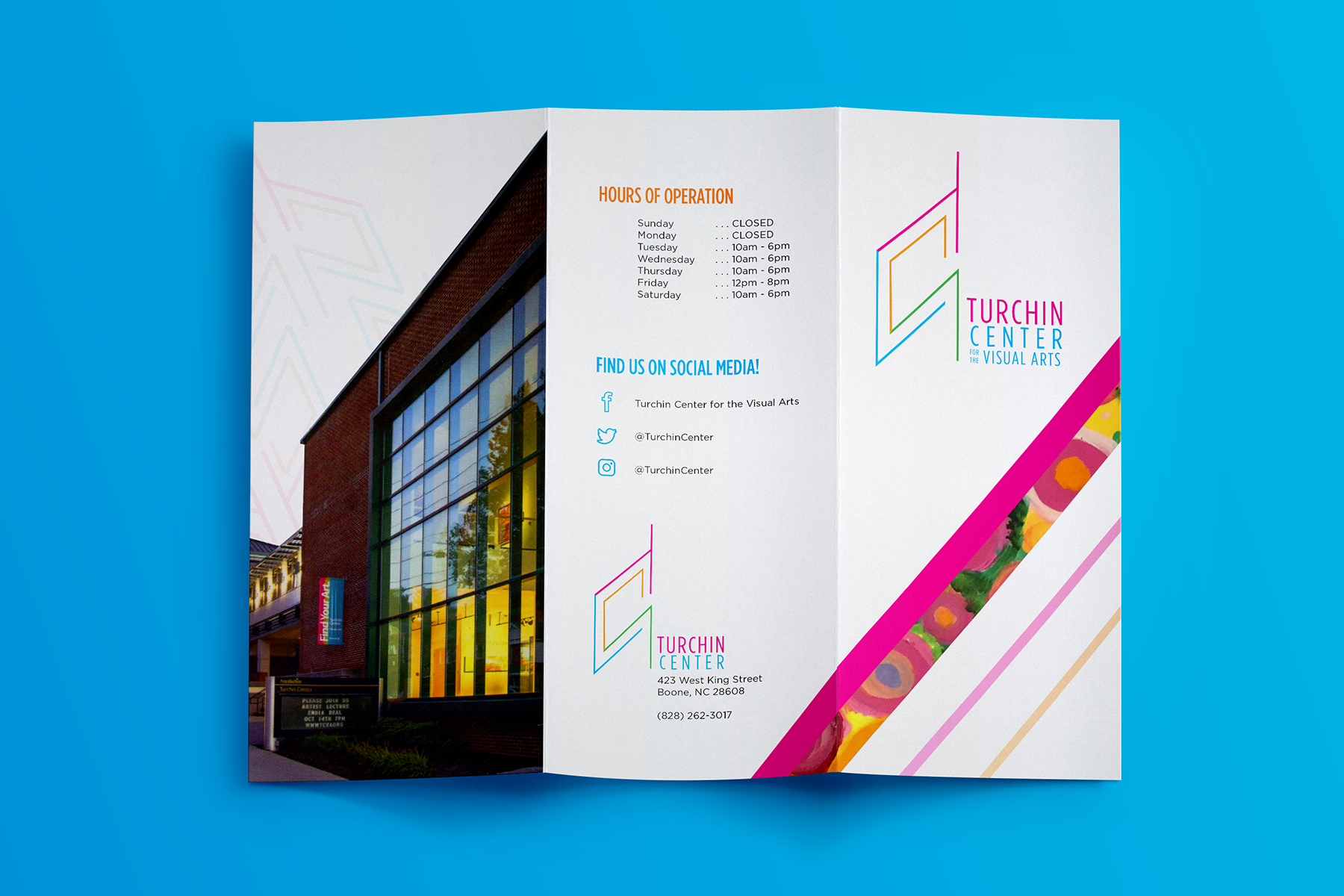
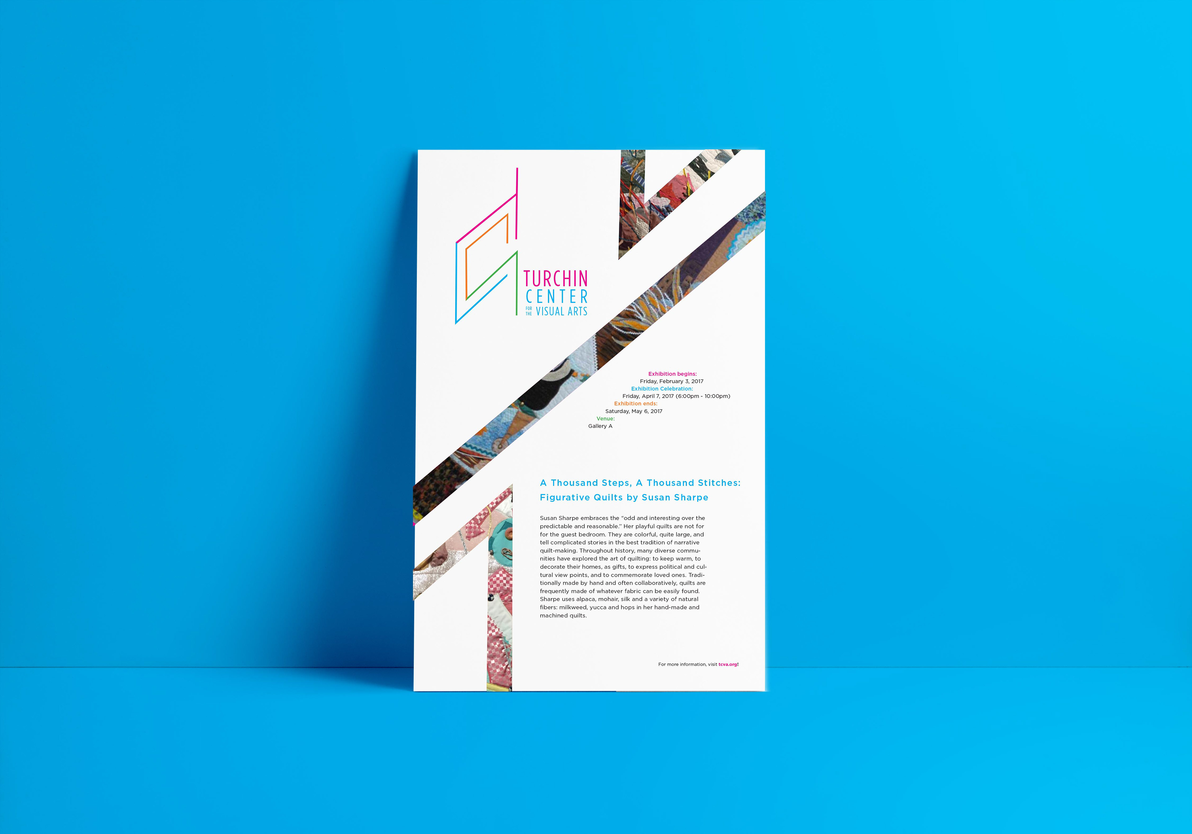
We created deliverables of business cards, brochures, buttons and posters. The brochure and posters featured above were designed by me.